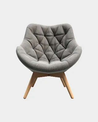
Sale
Arca Armchair 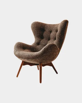
€1,480 Was €1,780
Reference
Every swatch below is painted with the token it names, every button carries the class you would write, and the printed values are read from the live stylesheet rather than typed in. If this page is wrong, the theme is wrong.
src/styles/tokens.css
Seven values, one accent. Clay brown carries every interactive state in the theme, which is why nothing else competes with it — a second accent would make neither mean anything.
Paper White
--color-paper-white
—
Page ground
Ink Black
--color-ink-black
—
Body copy, primary button
Clay Brown
--color-clay-brown
—
The single accent
Soft Sand
--color-soft-sand
—
Hairlines, image ground
Olive Gray
--color-olive-gray
—
Secondary copy
Warm Stone
--color-warm-stone
—
Borders, muted labels
Charcoal Green
--color-charcoal-green
—
Dark sections
src/styles/typography.css
Cormorant Garamond sets everything that is meant to be looked at; Satoshi sets everything meant to be read. Both are self-hosted through Astro's Fonts API with metric-matched fallbacks, so nothing reflows when the webfont lands.
Aa Bb Cc 123
Cormorant Garamond
Aa Bb Cc 123
Satoshi
Rooms that tell a story
Grab the last pieces
The Return of Tactile Materials
coming home to
A curated edit of furniture and objects for rooms that are still being decided.
After years of surfaces stripped smooth, something is shifting. The rooms people linger in now are built around texture.
Made to order in Portugal · 4–6 weeks
Material focus
src/styles/buttons.css
Every variant is .btn plus one modifier. They are square by design — .btn--pill
is the exception, used where a control sits over an image. It sets shape only, so it combines with a colour
variant rather than replacing one.
Variants
On a dark section
Sizes and states
Text linkcontact.css · checkout.css
Fields take a clay-brown border on focus rather than a glow. Note the visible labels: the source used placeholders alone in several places, which vanish the moment someone starts typing.
Hint text sits below the field, never inside it.
src/components/ui/Icon.astro
One registry, so stroke width and viewBox cannot drift between the places an icon appears. Every branch must
set width and height — npm run check:icons fails the build otherwise,
after an unconstrained checkmark once rendered 1905px tall.
src/styles/tokens.css
These values are read from the page you are looking at, so they follow the breakpoint you are reading it in. Narrow the window and watch them step down at 1024px and 640px.
--section-py
—
Vertical rhythm of a section. Steps down at 1024px and 640px.
--container-px
—
Gutter inside .container.
--gap
—
Grid gap — product grids, card rows.
--container-max
—
Widest the content ever gets.
--t-fast
—
Hover and colour changes.
--t-med
—
Panels, drawers, anything that travels.
src/components/product/
Real <ProductCard> components fed real products from the catalog — one on sale, one not,
because the price row renders differently for each. Hover to raise the Add-to-Cart bar and the three action
pills. The buttons work: this is the shop's card, not a picture of it.
Changing any of this
Colours, type and spacing all come from src/styles/tokens.css — one file, and every page
follows. Component styles live in src/styles/components/, section styles in
src/styles/sections/ and page styles in src/styles/pages/, always named after the
component or route that imports them.
Import order in global.css is a dependency order, not a preference: tokens → base → layout →
typography → buttons → animation. There is no utility framework — every rule reads the tokens above.